Wednesday 16 October 2013

Main Image


Final Front Cover

This is my final school magazine cover. I have edited my main image as i felt the background of the un-edited version didn't look right for the magazine snd the edited version looked a lot more effective. The final magazine cover is how i expected it to look, i didn't change anything from my draft to this and i knew what i wanted it to look like. 


 This is the un-edited picture i have chosen to be displayed on my front cover of my magazine. I chose this as the photo is showing a female student from King Henry school holding a piece of healthy food so that it goes with my splash of 'Healthy Eating'. The reason that I chose this photo out of all of them is because I felt that it was effective that the student was smiling with a piece of fruit. I prefer the medium camera shot rather than the close up shot because it gets the students body language and facial expressions in rather than just her face.
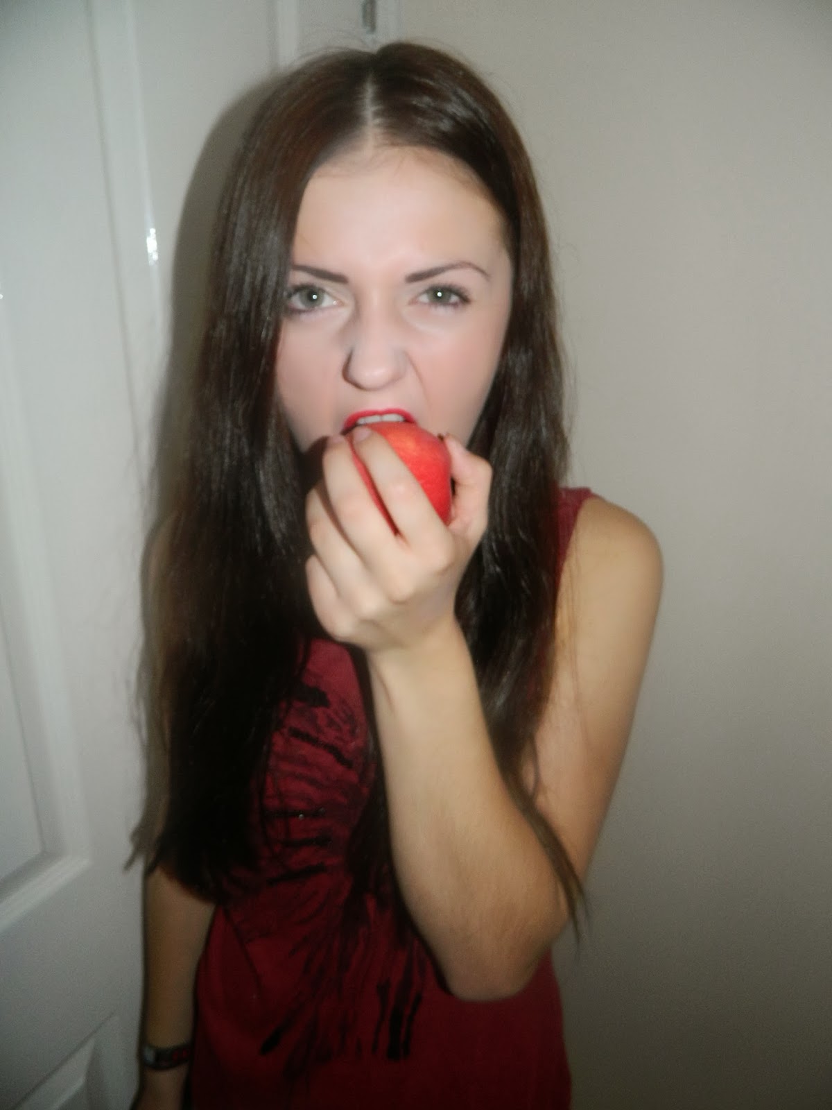
 This was one of the shots I took for my main image but I felt that this image wasn't suitable for a school magazine as I think that the way the female is positioned with the piece of fruit could be portrayed as looking promiscuous which didn't fit into my Splash about how the school have new 'Healthy Eating'.


I have decided not to use any of these three photos for my main image. I think that the reader would focus on the girl's face rather than the purpose that she is holding an apple to emphasise healthy eating because there are close up shots which makes the reader want to look at her facial expression.

Subsidiary images


These three photos are my first subsidiary images which I took without any editing. These three images are advertising the healthy eating in the school canteen. The audience that these will apply to are the students/teachers that attend King Henry School. I used different camera angles to make the pictures look more effective. I also decided to get a glimpse of the juice at the bottom of the shots so that the reader can also get an idea of what other drink we have to offer in the school canteen.


This is one of my un-edited subsidiary images that I have chosen to use for the magazine cover. I chose this because I thought that it looked good with the angle that I have took it in. I also added a pine-apple to the fruit tray, which stands out more showing that the canteen offer different fruits. This is a un-edited version of the picture. The reason I chose to have the picture un-edited without Photoshop is because I thought that the canteen shown in the background looks effective because all of the pupils know for sure that there is healthy eating in school.


This is my second subsidiary image that I chose to use for my front cover. I took this photo of the sign in the school canteen because I thought that it would emphasise the purpose of the school magazine that we are introducing updated healthy eating. I also decided to get the fruit tray in the background of my image because I wanted to show evidence to the reader that we are actually serious about our new healthy eating criteria. I also decided to take these photos in the school canteen instead of the kitchen area of the school so that the new healthy eating system would look appealing to the students, it looks realistic and the student will know exactly where the food we have to offer are located before hand for example in our fruit trays/trolley.


Thursday 10 October 2013

This is my first draft of my magazine cover.I have chosen the colour scheme to be black, yellow and red. I have chosen this as i feel that these colours do not only stand out, black and yellow are the King Henry traditional colors. I chose this format as i felt that it was basic and and eye catching especially if you look at my magazine 'pug' which reads 'Bargain 50p' which i thought was a cheap price for students.


The masthead of my magazine is called 'King Henry Social'. I chose this masthead because it links with school and it sounds catchy.I chose black and yellow as they are the school colors and the colors stand out!

The sell lines i have chosen are giving a cliff hanger onto getting you to buy the magazine. The first sell line says 'KHS pupil gets his art work displayed in London Art Gallery, read page 22 for more.. this sell line gets you to open the magazine which will get people to buy it especially if they are interested in knowing. The other sell line is 'Exclusive interview with KHS dinner lady who won the 'Big One' this sell line could mean anything as the costumers/students don't actually know what the 'Big One' is.

I chose the Splash as 'Healthy Eating' because it's a good way to inspire pupils in King Henry to eat healthy and buy food from the school canteen, also if people are interested to know how the dinner ladies/school teahcers got the menu together there is also a sell line quote from the dinner ladies telling you how they got the menu. I chose the colour red for the 'Healthy Eating' font as i felt that it would bring attention to people and also goes with the colour scheme of the magazine. I chose the splash to be in a font of bubbled writing as i thought that it made it look bold and big as i felt that it was a important part of the magazine.

I chose the Pug to be simple but cheap and cheerful as shown above as 50p. I chose the background colour to be red just like i have used with my splash, i chose the colour red as it's a bold bright colour. I added on the pug that it is a 'BARGAIN' this emphasizes how cheap it is and that it's a reasonable price!


I chose to have a header bar so that it would look short but give information in the highlighted bar to show the importance of the news being given to the readers. The header bars are wrote in capital letters because it makes it stand out even if they are only short headers. Einheader bars don't say alot they are eye catching because they are on the top of the page and the bottom of the page, they also yellow so that they stand out.